---
category: Components
group: Data Display
title: Tooltip
cover: https://mdn.alipayobjects.com/huamei_7uahnr/afts/img/A*3u9eSZO_4c0AAAAAAAAAAAAADrJ8AQ/original
coverDark: https://mdn.alipayobjects.com/huamei_7uahnr/afts/img/A*gwrhTozoTC4AAAAAAAAAAAAADrJ8AQ/original
demo:
cols: 2
---
A simple text popup tip.
## When To Use
- The tip is shown on mouse enter, and is hidden on mouse leave. The Tooltip doesn't support complex text or operations.
- To provide an explanation of a `button/text/operation`. It's often used instead of the html `title` attribute.
## Examples
Basic
Placement
Arrow
Auto Shift
Adjust placement automatically
Destroy tooltip when hidden
Colorful Tooltip
_InternalPanelDoNotUseOrYouWillBeFired
Debug
Disabled
## API
| Property | Description | Type | Default |
| -------- | ----------------------------- | ---------------------------- | ------- |
| title | The text shown in the tooltip | ReactNode \| () => ReactNode | - |
### Common API
The following APIs are shared by Tooltip, Popconfirm, Popover.
| Property | Description | Type | Default | Version |
| --- | --- | --- | --- | --- |
| align | This value will be merged into placement's config, please refer to the settings [rc-tooltip](https://github.com/react-component/tooltip) | object | - | |
| arrow | Change arrow's visible state and change whether the arrow is pointed at the center of target. | boolean \| { pointAtCenter: boolean } | true | 5.2.0 |
| autoAdjustOverflow | Whether to adjust popup placement automatically when popup is off screen | boolean | true | |
| color | The background color | string | - | 4.3.0 |
| defaultOpen | Whether the floating tooltip card is open by default | boolean | false | 4.23.0 |
| destroyTooltipOnHide | Whether destroy tooltip when hidden | boolean | false | |
| getPopupContainer | The DOM container of the tip, the default behavior is to create a `div` element in `body` | (triggerNode: HTMLElement) => HTMLElement | () => document.body | |
| mouseEnterDelay | Delay in seconds, before tooltip is shown on mouse enter | number | 0.1 | |
| mouseLeaveDelay | Delay in seconds, before tooltip is hidden on mouse leave | number | 0.1 | |
| overlayClassName | Class name of the tooltip card | string | - | |
| overlayStyle | Style of the tooltip card | object | - | |
| overlayInnerStyle | Style of the tooltip inner content | object | - | |
| placement | The position of the tooltip relative to the target, which can be one of `top` `left` `right` `bottom` `topLeft` `topRight` `bottomLeft` `bottomRight` `leftTop` `leftBottom` `rightTop` `rightBottom` | string | `top` | |
| trigger | Tooltip trigger mode. Could be multiple by passing an array | `hover` \| `focus` \| `click` \| `contextMenu` \| Array<string> | `hover` | |
| open | Whether the floating tooltip card is open or not. Use `visible` under 4.23.0 ([why?](/docs/react/faq#why-open)) | boolean | false | 4.23.0 |
| zIndex | Config `z-index` of Tooltip | number | - | |
| onOpenChange | Callback executed when visibility of the tooltip card is changed | (open: boolean) => void | - | 4.23.0 |
## Design Token
## FAQ
### Why sometime not work on HOC?
Please ensure that the child node of `Tooltip` accepts `onMouseEnter`, `onMouseLeave`, `onPointerEnter`, `onPointerLeave`, `onFocus`, `onClick` events.
### What's the placement logic?
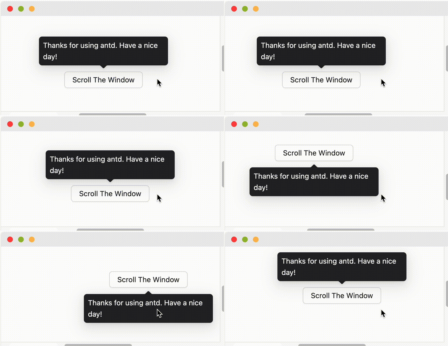
It will follow `placement` config when screen has enough space. And flip when space is not enough (Such as `top` to `bottom` or `topLeft` to `bottomLeft`). Single direction such as `top` `bottom` `left` `right` will auto shift on the view:
 When `placement` is set to edge align such as `topLeft` `bottomRight`, it will only do flip but not do shift.
 When `placement` is set to edge align such as `topLeft` `bottomRight`, it will only do flip but not do shift.