Table of Contents
- 01.布局和栅格 / Layout & Grid
- 常见页面布局 / Common Page Layout
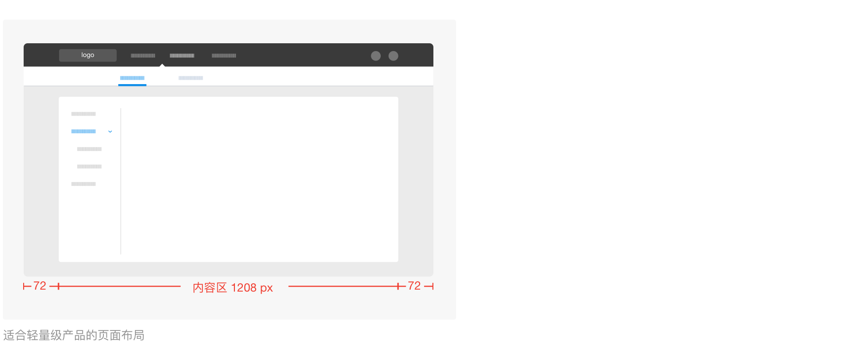
- 自适应界面-居中式 / Adaptive Interface-Centered Style
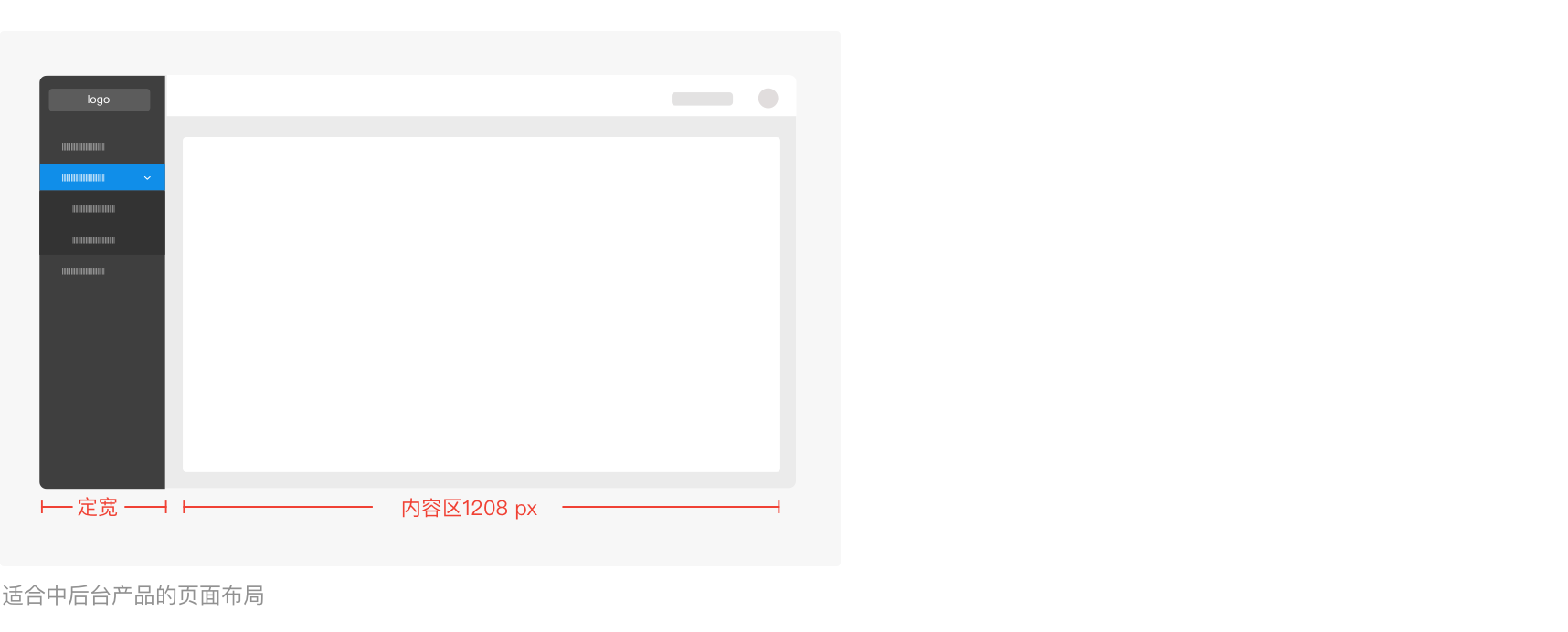
- 自适应界面-撑满式 / Adaptive Interface-Filled Style
- 容器 / Container
- 栅格 / Grids
- 02.字体和图标 / Fonts & Icons
- 间距 / Spacing
- 对齐方式 / Alignment
- 文案类左对齐 / Texts Align to the Left
- 数字类右对齐 / Numbers Align to the Right
- 表单类对齐 / Forms Align to the Center
- 文案规则 / Wording & Formatting Rules
This file contains Unicode characters that might be confused with other characters. If you think that this is intentional, you can safely ignore this warning. Use the Escape button to reveal them.
Ant Design 是一个致力于提升『用户』和『设计者』使用体验的中台设计语言,利用统一的规范进行设计赋能,全面提高中台产品体验和研发效率。此文摘录了设计或编码时最常遇见和易犯错的点,帮助设计者在使用 Ant Design 前了解重点信息,在使用过程中提醒备忘之用。
Ant Design is a design framework dedicated to improving the experience of "users" and "designers." It uses unified specifications to empower design and enhance the overall product experience and R&D efficiency. This article highlights the most common and prominent mistakes during design or coding, aiming to help designers understand critical information before using Ant Design and serve as a reference during its use.
01.布局和栅格 / Layout & Grid
常见页面布局 / Common Page Layout
为了产品间的系列感和页面间的可复用性,我们统一了设计稿的页面宽度和栅格比例,设计师在设计时可按 页面总宽 1440px,内容区 1208px 来设定页面宽度,也可以在 Ant Design Component Template 的 sketch 模板 中找到合适的模板拖拽使用,工程师则在 常用布局 里直接调取。
To establish a sense of consistency across products and enhance reusability between pages, we have standardized the page width and grid ratio of the design template. When designing, designers can set the page width to total page width 1440px, content area 1208px , you can also find the suitable templates in the sketch template provided by the Ant Design Component Template and use them by simply dragging and dropping. Engineers can also access it directly from the [Common layout](https://design.alipay .com/develop/web/components/layout/).
自适应界面-居中式 / Adaptive Interface-Centered Style
代码实现时应注意:/ Please Note the Following during Implementation:
当浏览器宽度 ≥1440px 时,内容区不再扩大; 当浏览器宽度 ≤1440px,≥ 1024px 时,内容区缩小,外留白 72px; 当浏览器宽度 < 1208px 时,去除外留白,浏览器底部出现滚动条;
When the browser width is ≥ 1440px, the content area will no longer expand. When the browser width is ≤ 1440px and ≥ 1024px, the content area is reduced with a 72px wide blank space. When the browser width is < 1208px, the outer blank space is removed, and a scroll bar appears at the bottom of the browser.
自适应界面-撑满式 / Adaptive Interface-Filled Style
侧边导航宽度视具体业务而定,右边内容区宽度则随浏览器宽度而改变。 当内容区宽度不足 1024px 时,浏览器底部出现滚动条;
The width of the side navigation depends on the specific business, and the width of the content area on the right changes with the width of the browser. When the width of the content area is less than 1024px, a scroll bar appears at the bottom of the browser;
容器 / Container
容器是用来收纳和组织对象的贮存器,理论上信息不应超出容器范围。为保持设计的一致性,我们为页面设定了统一的容器区域,让信息能保持在固定的位置,防止在页面跳转的时候出现内容闪动。
A container is a storage used to store and organize objects. In theory, content should not exceed the boundaries of the container. To maintain design consistency, we establish a standard container area for the page. This keeps the content in a fixed position and prevents the content from flickering when the page jumps.
栅格 / Grids
栅格通常会在卡片式布局、多列表单中使用到。栅格有助于界面的版面布局和信息分布,及屏幕响应的灵活性。
Grids are typically used in card layouts and multi-column forms to enhance the layout and distribution of information on the interface. They also contribute to the flexibility of screen responsiveness.
栅格公式:/ Grids Formula
我们为页面栅格的 Gutter 设定了间隔定值为 16px 和 24px 两种,即 浏览器在一定范围扩大或缩小,栅格的 Column 宽度会随之扩大或缩小,但 Gutter 间隔不变。
We have established two spacing settings for the page grid's Gutter: 16px and 24px. When the browser's size changes within a specific range, the grid's Column width adjusts accordingly, while the Gutter interval remains constant.
在 sketch 中可在 View/Canvas/Layout Settings 中设置,但 gutter on outside 选项不要启动,否则最后一列会有多余的空格。
In Sketch, you can set this in View/Canvas/Layout Settings, but the 'gutter on outside' option should not be enabled; otherwise, there will be extra spaces in the last column.
02.字体和图标 / Fonts & Icons
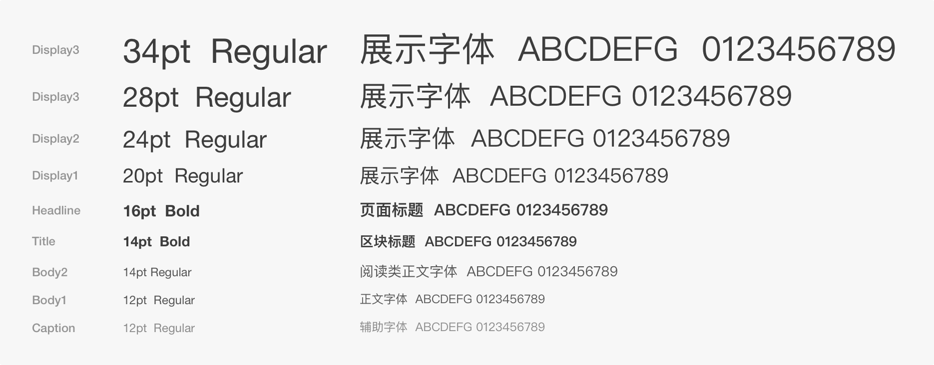
字号选用范围 / Fonts Size Range
如特殊场景需加大字号,可根据 Ant Design 字阶表增加字号,但建议不超过 48pt。
If a larger font size is required in specific scenarios, it can be increased according to the Ant Design font table. However, it is recommended not to exceed 48pt.
行高规则 / Row Spacing Guidelines
行高是能很好的控制行间距以提升阅读体验。段落内文字使用默认行高;段落与段落之间的间距为 1 倍字高,如,当字号为 14 号时,段落间距则为 14px。
单行文字则不需要设置行高,如:标题、页面名称等。
Row spacing is crucial for enhancing the reading experience. Text within paragraphs uses the default spacing, while the spacing between paragraphs is set to 1 times the font height. For instance, with a font size of 14, the spacing between paragraphs is 14px.
There is no need to adjust the row spacing for single lines of text, such as titles, page names, etc.
常用图标尺寸 / Common Icon Sizes
品牌色 / Brand Color
中性色 / Neutral Color
功能色 / Function Color
间距 / Spacing
我们根据页面信息结构和内容层级,利用大、中、小三种间距来实现信息之间的亲密度区分;在 Ant Design 中,我们将间距定义为以下三种:
Based on the page's information structure and content level, we use three types of spacing: large, medium, and small to create a hierarchy between information. In Ant Design, we define spacing in the following three types:
对齐方式 / Alignment
文案类左对齐 / Texts Align to the Left
当页面的字段或段落较短、较散时,需要确定一个统一的视觉起点,因此我们建议文案类统一使用左对齐的方式。
When the fields or paragraphs on the page are short and scattered, it's important to establish a unified visual starting point. Therefore, we recommend that text types consistently use left alignment.
数字类右对齐 / Numbers Align to the Right
为了快速对比数值大小,我们采用小数点对齐,并保留相同位数的有效数值。
To facilitate a quick comparison of numerical values, we utilize decimal point alignment and ensure that valid values have the same number of digits.
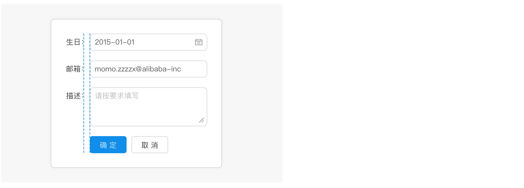
表单类对齐 / Forms Align to the Center
文案和输入框都分别向中间间距对齐能让内容锁定在一定范围内,让用户眼球顺着间距的视觉流,就能找到所有填写项,从而提高填写效率。
Center-aligning the text and input boxes can create a designated space that allows users to follow the visual flow and quickly locate all filled-in items, thereby enhancing the efficiency of form filling.
文案规则 / Wording & Formatting Rules
时间、日期表示方式:/ Time & Date Format
为了格式区分,Ant Design 中年月日之间用半角短横线『-』,时分秒之间使用半角冒号『:』 表示范围之间使用半角波浪线『~』或使用中文 『至』,并在其前后加上间隔以示区分
To distinguish between formats, Ant Design utilizes a half-width dash '-' between the year, month, and day, and a half-width colon ':' between the hours, minutes, and seconds. For representing ranges, use a half-width wavy line '~' or 'to' and include intervals before and after them to clearly indicate distinctions.
空格规范:
- 全角字符和半角字符搭配时,需要添加空格。最常见的全角字符:汉字。常用的半角字符:英文、数字。
- 中文链接之间增加添加空格。
Space Guidelines:
- When combining full-width characters and half-width characters, it's necessary to add spaces. Example of the most common full-width characters: Chinese characters. Commonly used half-width characters: English, numbers.
- Insert spaces between Chinese text links.
特殊数值的表示方式:
- 金额的间隔方式:
1,000,000。 - 小数点后保留两位:
200.00。
Representation of Special Values:
- Formatting for amounts:
1,000,000. - Maintain two decimal places:
200.00.
以下情况不使用句号:
- 输入框下的提示;表格中的句子。
- 句末为文字链(链接前使用句号)。
No Periods in the Following Situations:
- Prompts under the input box; sentences in the table.
- The end of the sentence is a link (use a period before the link).
专业精准的用词建议:
- 使用『你』代替『您』,以拉近与用户之间的距离,尽量不使用『我』,避免对象指向不明。
- 使用『编辑』代替『修改』。
- 使用『其他』代替『其它』,『其他』的应用范围更广。
- 使用『此』代替『该』,当要表达当前事物时,『此』更加明确。
- 使用『抱歉』而不用『对不起』,如果是我们系统造成的结果,可以使用『抱歉』,如果是用户自己造成的结果,则不使用这类词。
- 使用『登录』而不用『登陆』,登录是登记记录用户输入信息的意思,切勿用成『着陆』的陆。
Sugeestion on Professional & Accurate Wordings:
- Avoid using "I" to maintain clear target orientation.
- Prefer "Edit" over "Modify.".
- This doesn't apply to English.
- This doesn't apply to English.
- Use "Apologies" instead of "Sorry." If it is the result of our system, you can use "Sorry." If it is the user's own doing, avoid using such words.
- This doesn't apply to English.
- Home
- Cookbook
- FAQ
- Template for Bug Report in IE8 9
- Contributing
- Maintaining
- Design


