 wxiaoguang
|
323c6cba20
|
Fine tune "dropdown button" icon (#25442)

----

|
2023-06-25 02:40:41 +00:00 |
|
 wxiaoguang
|
a1c5057fe8
|
Batch delete issue and improve tippy opts (#25253)
1. Add "batch delete" button for selected issues, close #22273
2. Address the review in
https://github.com/go-gitea/gitea/pull/25219#discussion_r1229266083
|
2023-06-19 15:46:50 +08:00 |
|
 wxiaoguang
|
46c17c8029
|
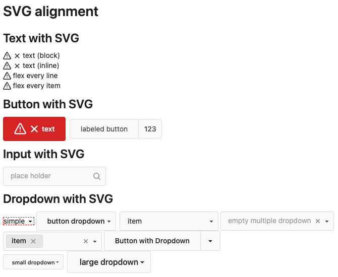
Use flex to align SVG and text (#25163)
The code can be as simple as:
```html
<div class="flex-text-block">{{svg "octicon-alert"}} {{svg "octicon-x"}} text (block)</div>
<div><div class="flex-text-inline">{{svg "octicon-alert"}} {{svg "octicon-x"}} text</div> (inline)</div>
<div><button class="ui red button">{{svg "octicon-alert" 24}} {{svg "octicon-x" 24}} text</button></div>
```
---------
Co-authored-by: Giteabot <teabot@gitea.io>
|
2023-06-14 16:40:15 +00:00 |
|
 HesterG
|
a43ea22479
|
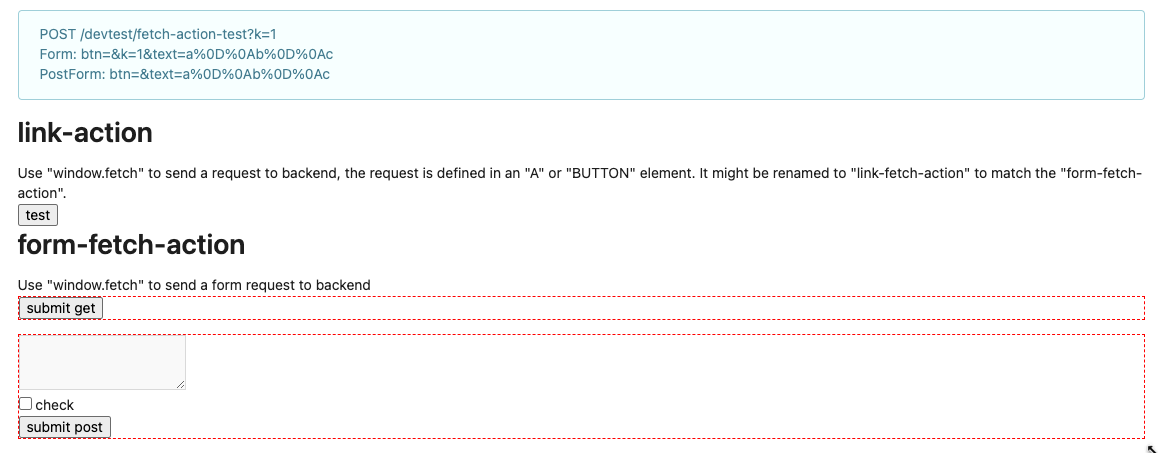
Change form actions to fetch for submit review box (#25219)
Co-author: @wxiaoguang
Close #25096
The way to fix it in this PR is to change form submit to fetch using
formData, and add flags to avoid post repeatedly.
Should be able to apply to more forms that have the same issue after
this PR.
In the demo below, 'approve' is clicked several times, and then
'comment' is clicked several time after 'request changes' clicked.
After:
https://github.com/go-gitea/gitea/assets/17645053/beabeb1d-fe66-4b76-b048-4f022b4e83a0
Update: screenshots from /devtest
>

>
>
>
>

---------
Co-authored-by: wxiaoguang <wxiaoguang@gmail.com>
|
2023-06-14 16:01:37 +08:00 |
|
 silverwind
|
623b3b590e
|
Button and color enhancements (#24989)
- Various corrections to button styles, especially secondary
- Remove focus highlight, it's annoying when it stays on button after
press
- Clearly define ghost and link buttons with demos in devtest
- Remove black, grey and tertiary buttons, they should not be used
- Make `arc-green` slightly darker

<img width="1226" alt="image"
src="https://github.com/go-gitea/gitea/assets/115237/8d89786a-01ab-40f8-ae5a-e17f40e35084">
<img width="1249" alt="image"
src="https://github.com/go-gitea/gitea/assets/115237/83651e6d-3c27-46ff-b8bd-ff344d70e949">

---------

Co-authored-by: wxiaoguang <wxiaoguang@gmail.com>
Co-authored-by: Giteabot <teabot@gitea.io>
|
2023-06-09 08:37:47 +00:00 |
|
 wxiaoguang
|
8a8b753647
|
Improve button-ghost, remove tertiary button (#24692)
<img width="474" alt="image"
src="https://github.com/go-gitea/gitea/assets/2114189/7fd231f9-71c3-4769-ba96-37a5b77cf224">

<img width="557" alt="image"
src="https://github.com/go-gitea/gitea/assets/2114189/c9945f61-39b4-4711-aea8-c34ef1d714c5">

<img width="641" alt="image"
src="https://github.com/go-gitea/gitea/assets/2114189/691be76e-74fd-420d-9b9e-ba1f3b08e0b4">

And a page to test buttons:

<details>

<img width="451" alt="image"
src="https://github.com/go-gitea/gitea/assets/2114189/5f61da24-2f36-40ad-a9bb-2205da5f5f04">

</details>

---------

Co-authored-by: Giteabot <teabot@gitea.io>
Co-authored-by: silverwind <me@silverwind.io>
|
2023-05-13 20:38:22 +00:00 |
|
 wxiaoguang
|
75c62054a6
|
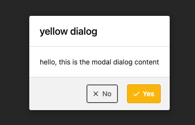
Improve some modal action buttons (#24289)
Follow #24097 and #24285
And add a devtest page for modal action button testing.
http://localhost:3000/devtest/fomantic-modal
Now the `modal_actions_confirm.tmpl` could support: green / blue /
yellow positive buttons, the negative button is "secondary".
ps: this PR is only a small improvement, there are still a lot of
buttons not having proper colors. In the future these buttons could be
improved by this approach.
These buttons could also be improved according to the conclusion of
#24285 in the future.
And add GitHub-like single danger button (context:
https://github.com/go-gitea/gitea/issues/24285#issuecomment-1519100312)

---------
Co-authored-by: silverwind <me@silverwind.io>
|
2023-04-24 07:08:59 -04:00 |
|
 wxiaoguang
|
7681d582cd
|
Refactor locale number (#24134)
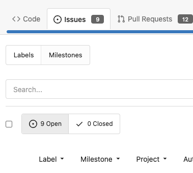
Before, the `GiteaLocaleNumber.js` was just written as a a drop-in
replacement for old `js-pretty-number`.
Actually, we can use Golang's `text` package to format.
This PR partially completes the TODOs in `GiteaLocaleNumber.js`:
> if we have complete backend locale support (eg: Golang "x/text"
package), we can drop this component.
> tooltip: only 2 usages of this, we can replace it with Golang's
"x/text/number" package in the future.
This PR also helps #24131
Screenshots:
<details>

</details>
|
2023-04-17 11:37:23 +08:00 |
|
 Yarden Shoham
|
b4e952545b
|
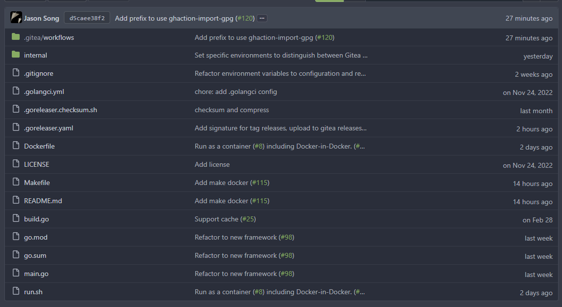
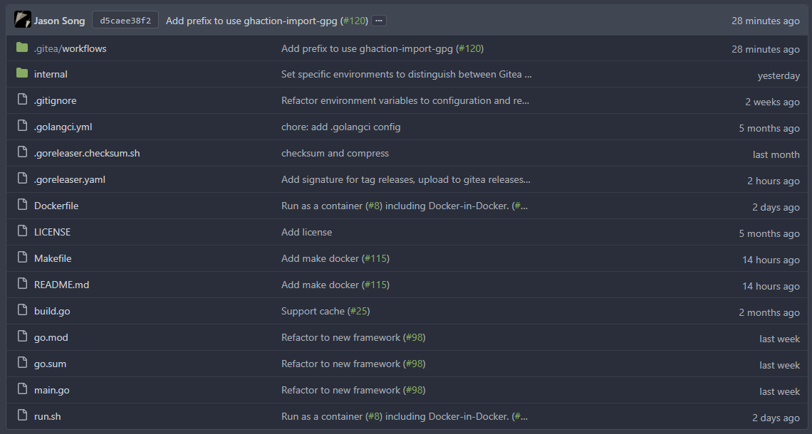
Remove untranslatable on_date key (#24106)
- Follows #23988
- Fixes: #24074 by removing this key
GitHub's `relative-time` elements allow us to force their rendering to
`auto`, `past`, or `future` tense. We will never show an absolute date
`on ...` in `TimeSince`
## Before
## After
---------
Co-authored-by: wxiaoguang <wxiaoguang@gmail.com>
|
2023-04-15 13:01:54 +02:00 |
|
 wxiaoguang
|
1c8bc4081a
|
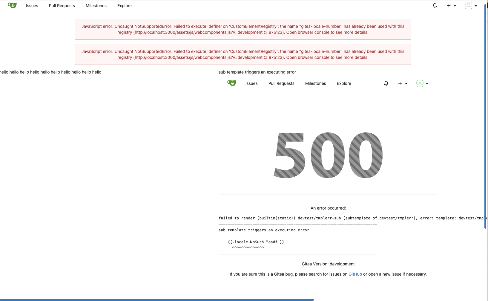
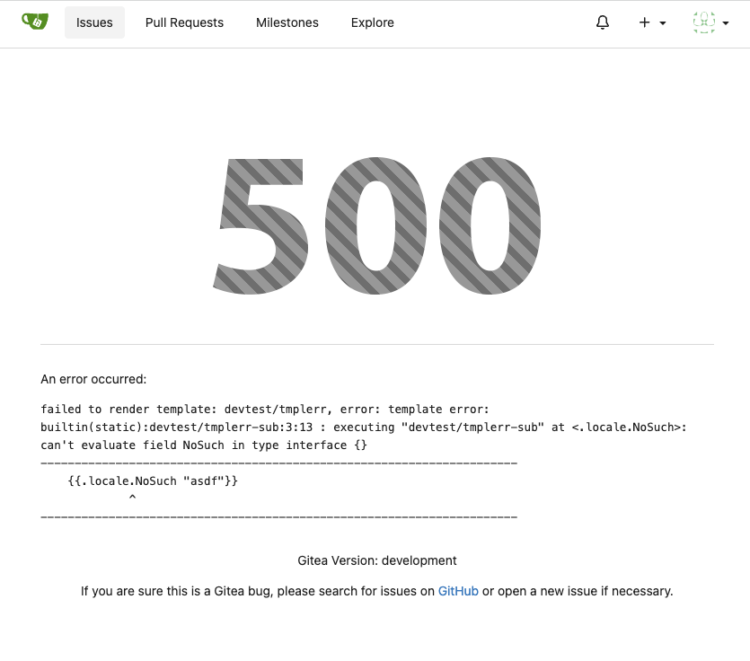
Show friendly 500 error page to users and developers (#24110)
Close #24104
This also introduces many tests to cover many complex error handling
functions.
### Before
The details are never shown in production.
<details>
</details>
### After
The details could be shown to site admin users. It is safe.
|
2023-04-14 13:19:11 +08:00 |
|
 wxiaoguang
|
5cc0801de9
|
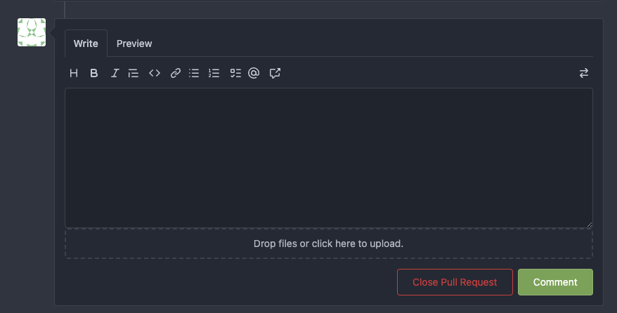
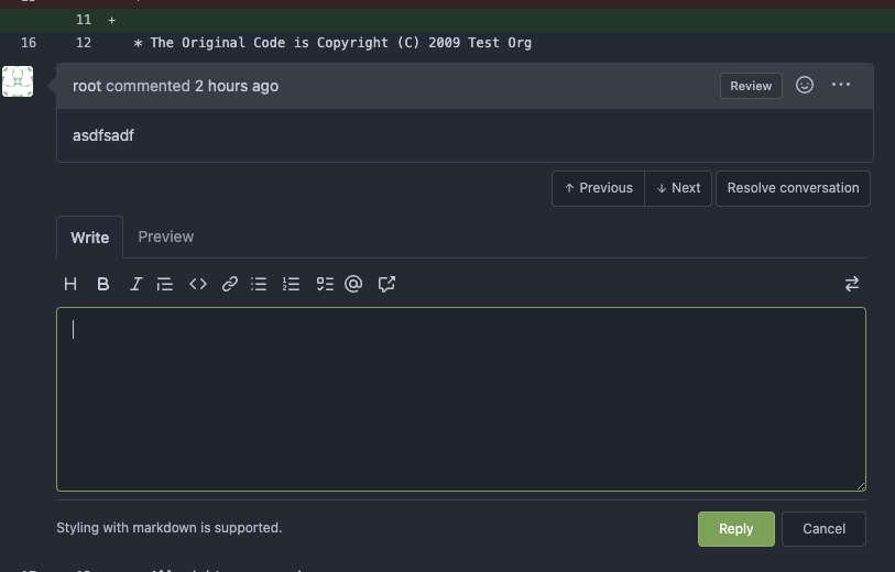
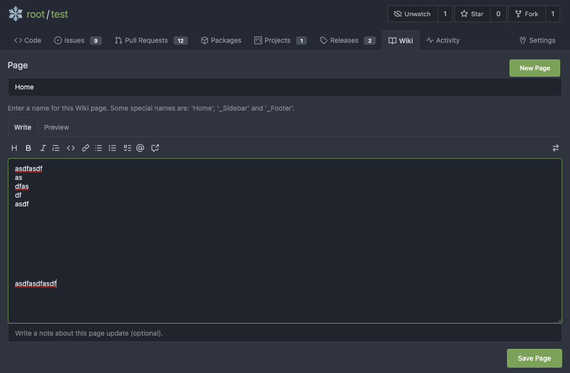
Introduce GitHub markdown editor, keep EasyMDE as fallback (#23876)
The first step of the plan
* #23290
Thanks to @silverwind for the first try in #15394 . Close #10729 and a
lot of related issues.
The EasyMDE is not removed, now it works as a fallback, users can switch
between these two editors.
Editor list:
* Issue / PR comment
* Issue / PR comment edit
* Issue / PR comment quote reply
* PR diff view, inline comment
* PR diff view, inline comment edit
* PR diff view, inline comment quote reply
* Release editor
* Wiki editor
Some editors have attached dropzone
Screenshots:
<details>

</details>
---------
Co-authored-by: silverwind <me@silverwind.io>
|
2023-04-03 18:06:57 +08:00 |
|