mirror of
https://github.com/go-gitea/gitea.git
synced 2025-07-23 06:07:19 +08:00
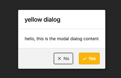
Follow #24097 and #24285 And add a devtest page for modal action button testing. http://localhost:3000/devtest/fomantic-modal Now the `modal_actions_confirm.tmpl` could support: green / blue / yellow positive buttons, the negative button is "secondary". ps: this PR is only a small improvement, there are still a lot of buttons not having proper colors. In the future these buttons could be improved by this approach. These buttons could also be improved according to the conclusion of #24285 in the future.  And add GitHub-like single danger button (context: https://github.com/go-gitea/gitea/issues/24285#issuecomment-1519100312)  --------- Co-authored-by: silverwind <me@silverwind.io> |
||
|---|---|---|
| .. | ||
| chroma | ||
| code | ||
| codemirror | ||
| console | ||
| features | ||
| markup | ||
| modules | ||
| shared | ||
| standalone | ||
| themes | ||
| admin.css | ||
| animations.css | ||
| base.css | ||
| dashboard.css | ||
| editor-markdown.css | ||
| editor.css | ||
| explore.css | ||
| font_i18n.css | ||
| form.css | ||
| helpers.css | ||
| home.css | ||
| index.css | ||
| install.css | ||
| organization.css | ||
| package.css | ||
| repository.css | ||
| review.css | ||
| runner.css | ||
| svg.css | ||
| tribute.css | ||
| user.css | ||