5.2 KiB
| category | order | title |
|---|---|---|
| Principles | 6 | Stay on the Page |
Solve most of problems on the same page and avoid a new one, because the page refresh and forwarding can lead to change blindness, in addition to disrupting the user’s mental flow.
** Change Blindness** is a surprising perceptual phenomenon that occurs when a change in a visual stimulus is introduced and the observer does not notice it. People's poor ability to detect changes has been argued to reflect fundamental limitations of human attention,from the term of Change blindness, Wikipedia.
** Flow**, also known as the zone, is the mental state of operation in which a person performing an activity is fully immersed in a feeling of energized focus, full involvement, and enjoyment in the process of the activity, from the term of Flow, Wikipedia
Overlays
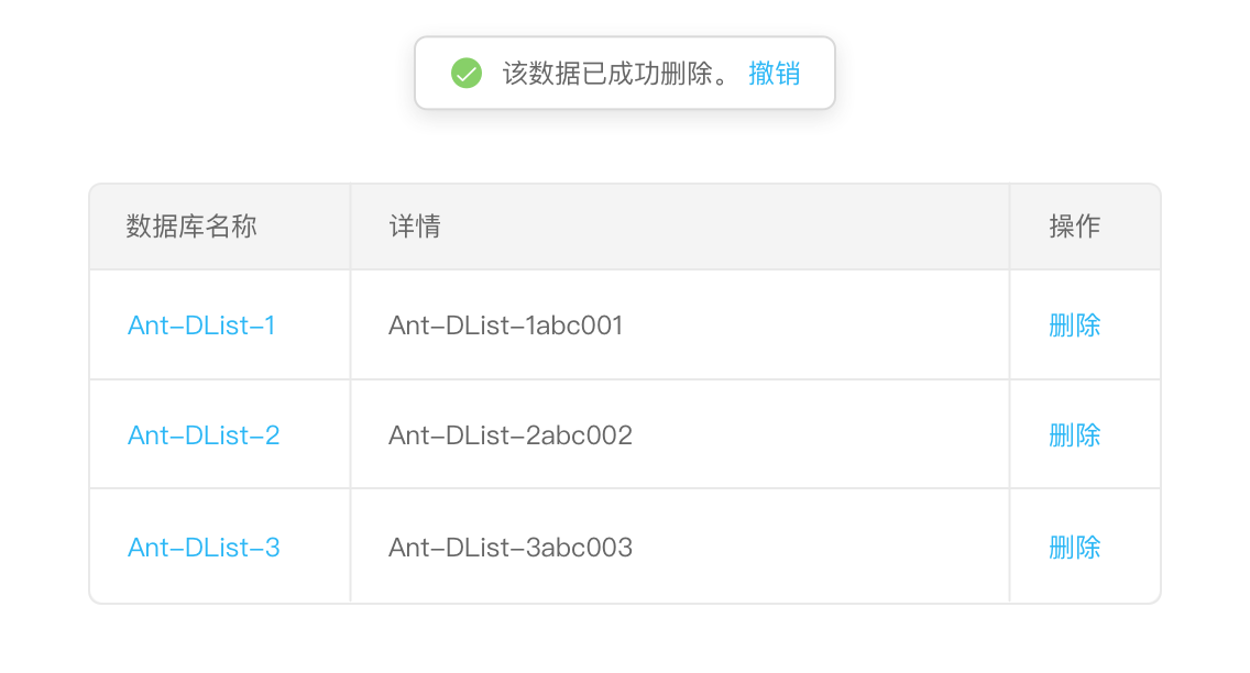
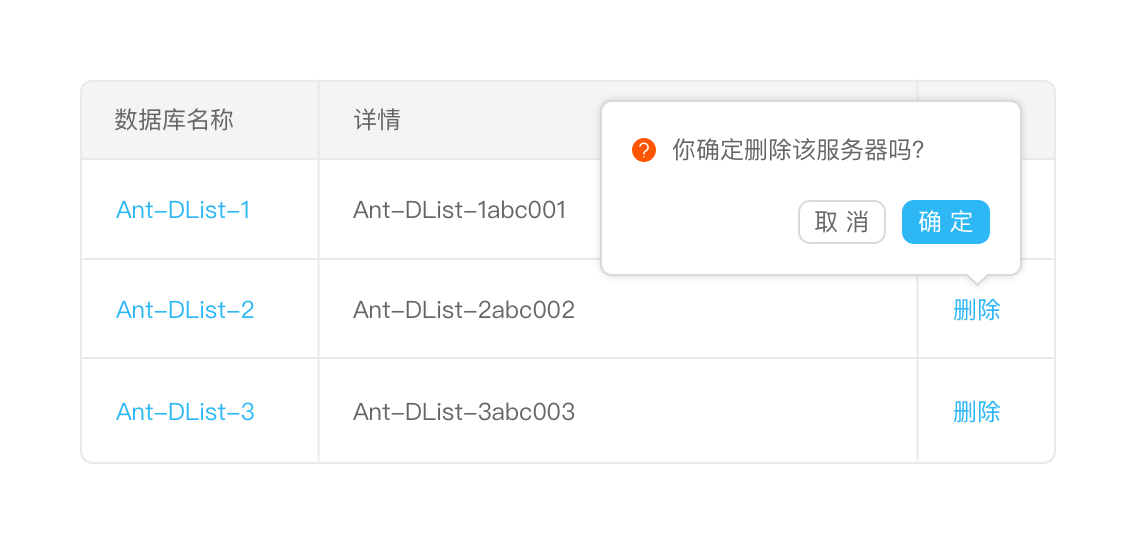
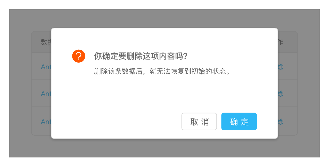
Double-confirm overlay: Using the Modal to double confirm should be avoided, while affording an opportunity to undo is preferred.

Detail Overlay: Allows an overlay to present additional information when the user clicks or hovers over a link or section of content.
Note that when a mouseover event occurs to trigger the Detail Overlay, 0.5-second delay needs to be added, and when the mouse is out, the overlay needs to be closed immediately.
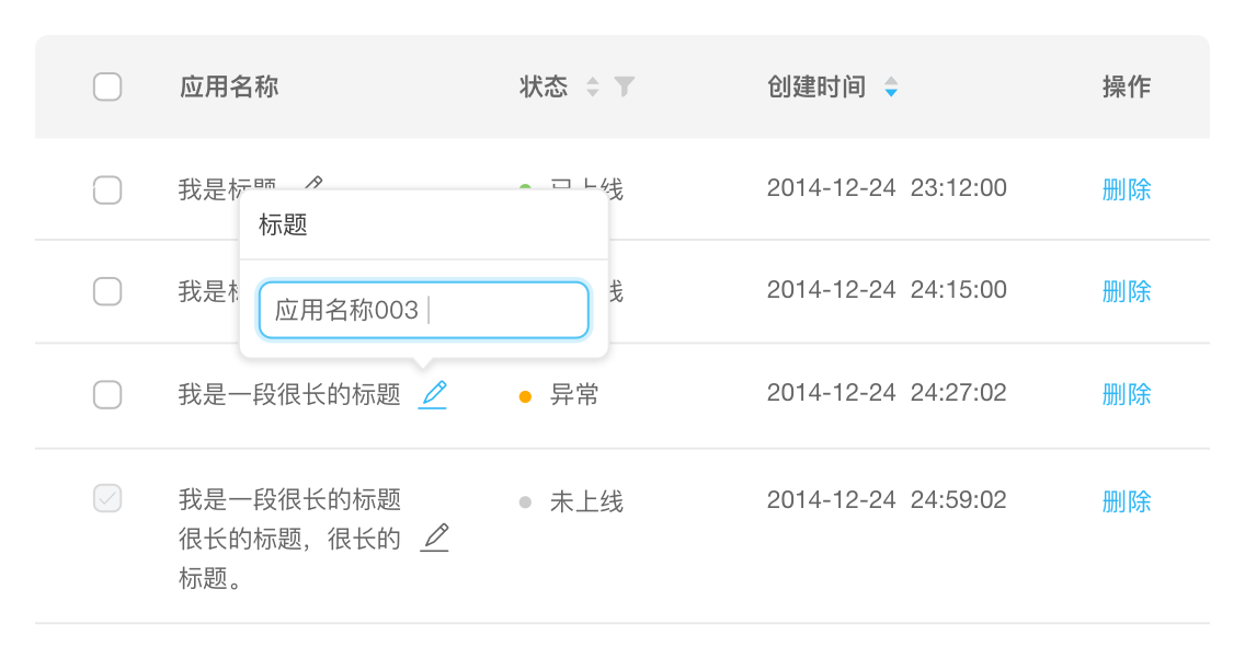
Input Overlay: Let the user enter small amounts of text on the overlay.
Inlays
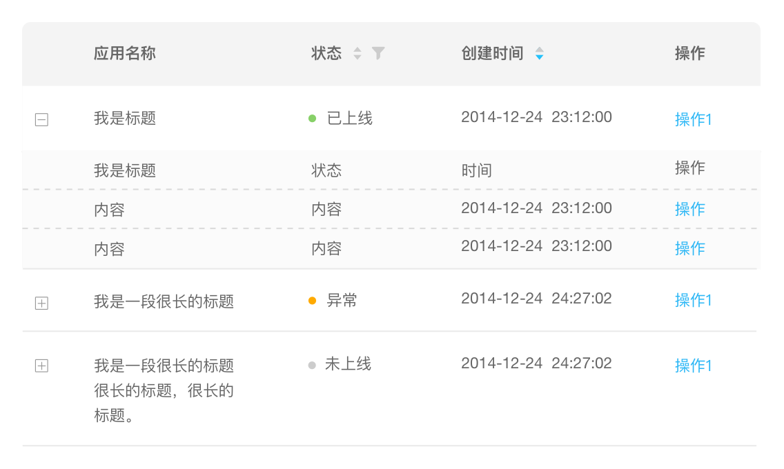
List Inlay: Works as an effective way to hide detail until needed — while at the same time preserving space on the page for high-level overview information.
Detail Inlay (coming soon)

Tabs: Provides additional panels of information accessible by tab controls.
Virtual Pages
In the process of interaction design, Overlays allow you to bring additional interactions or content in a layer above the cur- rent page. Inlays allow you to do this within the page itself. However, another powerful approach to keeping users engaged on the current page is to create a virtual page. That is to say, we create the illusion of a larger virtual page.
Virtual Scrolling and Pagination, more on Patterns/Lists/Show Long Lists
Carousel, more on Patterns/Lists/Show Images
Flexible User Interface (coming soon)
Process Flows
It has long been common practice on the Web to turn each step into a sepa- rate page. While this may be the simplest way break down the problem, it may not lead to the best solution. For some Process Flows it makes sense to keep the user on the same page throughout the process.
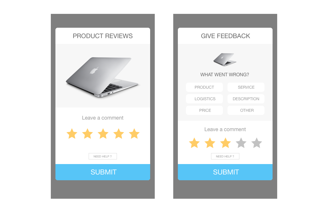
Responsive Disclosure: Make the experience for selecting painless by providing disclosures as quickly as possible, and doing it all in a single-page interface.
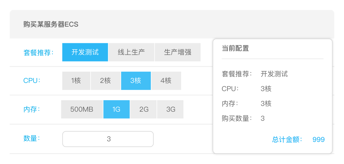
Configurator Process: Provides a configurator that allows users to help them accomplish the task or build their own product.
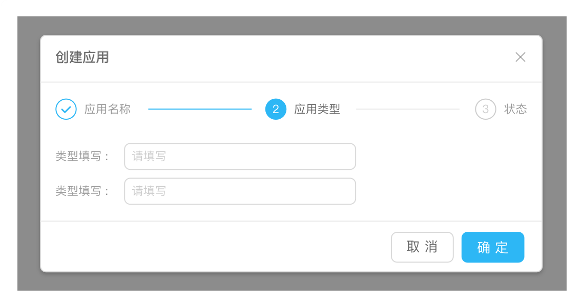
Dialog Overlay Process: Any page switch is an interruption to the user’s mental flow. In addition, any context switch is a chance for a user to leave the site. But sometimes the step-by-step flow is necessary.