5.2 KiB
| title | date | author |
|---|---|---|
| Stacked Notification | 2023-10-07 | MadCcc |
Stack
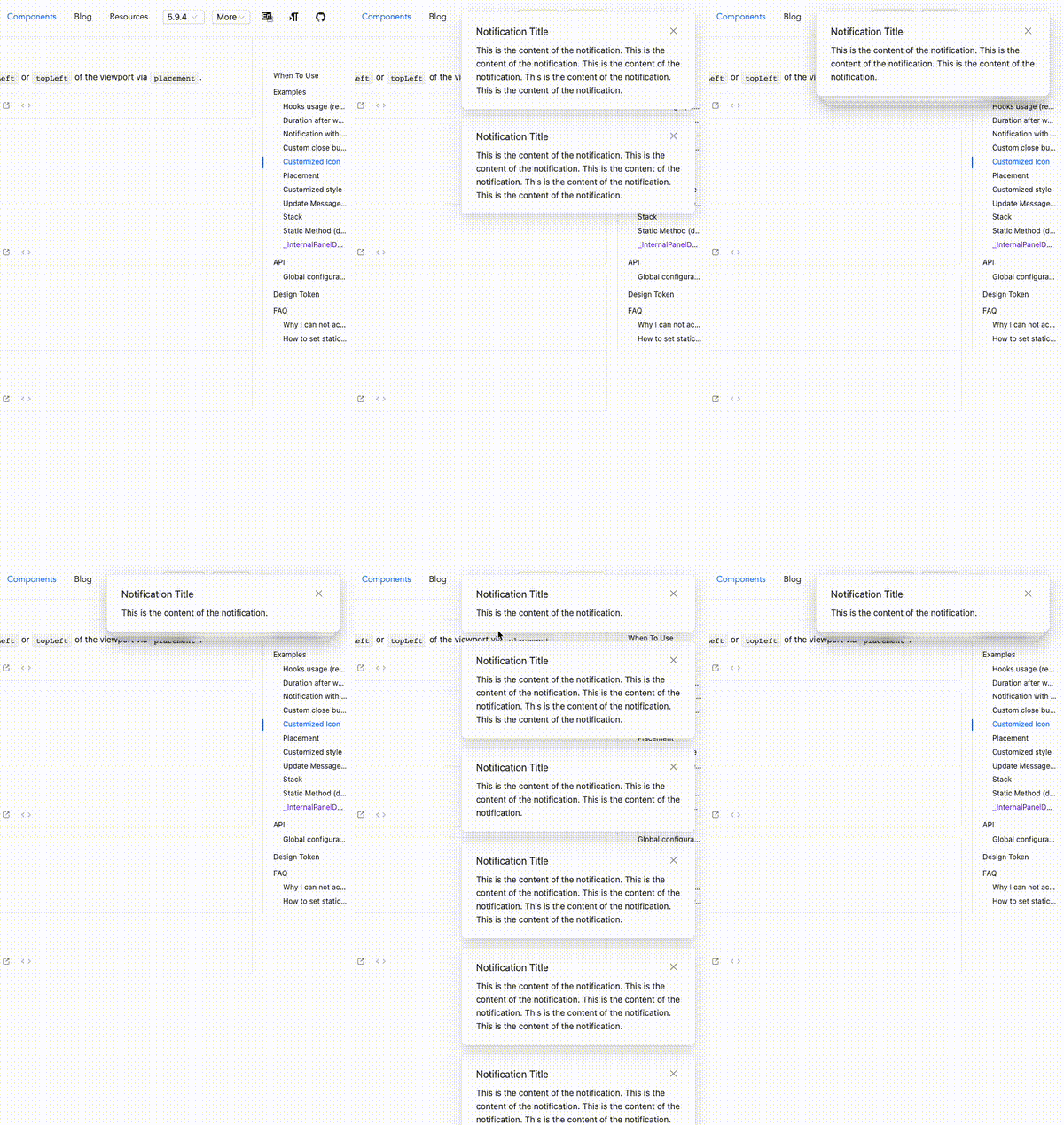
In 5.10.0, we introduced a new feature to Notification, which allows eye-catching reminders that would otherwise fill the screen to be stacked together, bringing a touch of agility to the originally tense component:
We liked this new feature so much that we made it the default behavior for Notification after 5.10.0. This feature will bring about some changes in the look and feel. For example, the order of notifications in the expanded state changes from bottom-to-top to top-to-bottom. This is exactly the opposite of the previous default behavior, but it is the best under the new animation. order.
Of course, users can pass stack: false to turn off this feature and return to the default behavior before 5.9.x. Please refer to our documentation for details.
Details
In order to implement this feature, we have been coding for a long time, hoping to make all the details perfect. We can start with the demands.
- The default trigger threshold for stacking is that more than three Notifications appear at the same time, which means that when the fourth Notification appears, the entire Notification group will be in a collapsed state. This threshold can be adjusted via
stack: { threshold: 3 }. - There are two Notifications that are visible behind the folded state, and we added a frosted glass background to them to further dilute their existence. It is worth mentioning that we have also optimized this effect for dark mode. You can click button on the bottom-right to switch themes to give it a try.
- All undisplayed Notifications do not disappear when collapsed. When you use the mouse to hover over the collapsed Notification group, all Notifications that have not been automatically closed will be expanded and arranged in order, and the duration of all Notifications will be refreshed.
- The folding direction will be different under different
placement, but it can only be divided into two types: upward or downward. The order of arrangement when expanded will also be from top to bottom or bottom to top.
Implementation
Dynamic Height
You may find that as the Notification height changes, the message hidden behind it is always posted below the latest message, and there will be no cross-border situations. Yes, in the collapsed state, all message boxes are limited to the same height as the latest message, which will bring several benefits:
- We don’t have to worry about the message behind being exceeded if the height of the latest message is too small;
- Just by giving a fixed offset, we can get the position and width of the two message boxes behind it, so as to get a smooth-looking animation effect.
Of course, it doesn't end as long as the heights are directly equal. Don't forget that our Notification supports expansion. When expanded, all message boxes should be restored to their original size, and the offset when expanded is calculated from the original height.
But the width and height have been modified, how do we restore it?
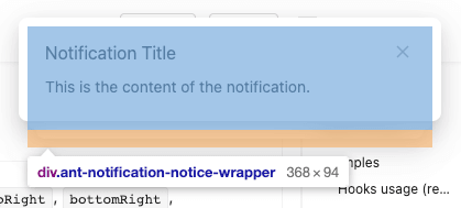
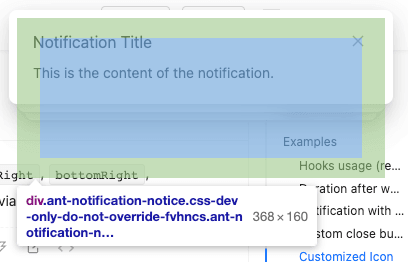
In order to implement this new feature, we added a new layer of div outside the original message box as a container for the message box to bear the responsibility of size changes. The original message box only retains the content part to ensure that its height is not affected by the container. The width of the container is changed by scaleX, which avoids the situation where the width change causes the text to wrap to increase the height of the container. Under this layer of structure, we can not only get the correct content size, but also modify the size of the container at will without affecting the layout of the content, killing two birds with one stone.
Positioning
In terms of positioning, we chose the simplest method, absolutely positioning all message boxes. When expanding, we calculate the height of each message box and accumulate its positioning offsets to achieve the current smooth animation effect.
If animation effects are not considered, there are other layout methods. For example, during the implementation process, we used flex layout to implement the order of expansion first, and then used negative margin to achieve the stacking effect. This is also an idea, but in fact there will be some problems with the animation effect: when a new message appears, all the messages below will have an instant displacement to make way for the new message. This problem and some other positioning problems will be merged together and ultimately difficult to solve perfectly, so we finally adopted the simplest method - absolute positioning, and all offsets were calculated manually.
Summary
This new feature is an attempt by the antd team to improve the flexibility and fashion of components. We hope to bring you a better experience~
Because it is a new feature, if you encounter usage problems or bugs, please feel free to send an issue.
Finally, I hope you all like this smart Notification~


